Complimentary Colors
Art in the Time of Corona
I walk…a lot. I walk for several reasons, and now in the time of Corona, I’m always wearing a mask and gloves. I walk mainly for my mental and physical health but I also walk for inspiration and often clarity. I get some of my most important insights while looking at flowers and grass and trees and listening to birds, which now in LA is possible since the amount of traffic has been cut way down. Nature is much more available and call me crazy, I prefer this over the anxiety of listening to cars and people honking their horns. Will miss it when things open up and people get back to pursuing their ambitions and what is happening in the zeitgeist in order to be cool. I am an outdoors kind of person. Would rather be out than in, almost any day unless it’s raining or cold. I still haven’t gotten over the fact that here we have more sunny days than not. Having grown up in the Midwest, each day that it was nice enough to be outside, you left everything behind in order to enjoy it. Here I have had to adjust, I won’t say learn because I have yet to totally integrate it, that living here in California doesn’t present that overly often which is great. You can stay inside on a sunny day and finish reading that book you are obsessing over because there will be another sunny day tomorrow. Anyway, short story long, I took a class in grad school, from Mary Winterfield at Pasadena Art Center. I remember her saying, if you want inspiration in color, just look at nature. It’s never ever wrong. I have written on this subject before in another blog post if you care to look back. but I wanted to illustrate that again, but this time in the context of color theory and photos of nature, one idea at a time.
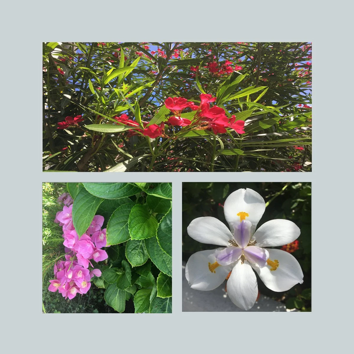
I always take my phone with me when I walk, using it as a camera to capture some of those notes of color that momma nature so willingly puts on display for us all. Her palette changes season to season and yes, California has seasons. Not as much of a swing as you might see in other places, but definite color and temperature changes that are noticeable. I can’t help but use my collection of all those photos for color reference should I need some advice for a painting. Especially when challenged to add that one last color that would make a piece really sing. Momma Nature tells me what to do.
This blog entry, is about how I have noticed the natural way color theory concepts play out around us and their use in painting. There are six types with multiple names for them. I use some of them more often than others since they are more naturally pleasing to me, artistic license so to speak. Every artist has their own particular palette and I am no excpetion. I am going to just talk about one of the six here. I will take each one in succession as I collect images to illustrate.
One of my favorites is called a complementary color scheme. A simple definition is that it constitutes colors opposite each other on the color wheel, which is actually a potential ton of combinations if you include tints and shades, which I do. As a painter, I never use them in their purest form since I don’t gravitate to those kinds of colors, with the exception of red which I find myself using in almost every piece in some form or another. That does not mean that I am attracted to red and green which is the purest form of one of the possibilities. Used in its purest form, it only reminds me of Christmas and that frankly is the only time of the year, i find it somewhat acceptable. Kind of like certain colors of blue that for me only belong on the bottom of a swimming pool Don’t take offense please, if you love it, it’s just my opinion. Color is so personal. We all like certain things and don’t care as much for others; no potential wrong and no potential right. I tend to like my colors neutralized rather than pure. Again, it’s just the nature of this beast. I’m not sure that it doesn’t come from where you have spent living the longest. I’ve been here in California for seventeen years now which is the second longest I have lived anywhere. Michigan was home the longest and since I was born there, probably registered somehow on my DNA. Michigan has a full gamut of color since there are four seasons to contend with. Summer is a profusion of green and blue with all the varied colors of flowers and wildlife. Spring is a softer version of summer, fall a warmer version and winter is almost colorless with grey, white and all types of neutrals. The occasional blue sky is the only hint of color that comes along unless you are lucky enough to see a cardinal.
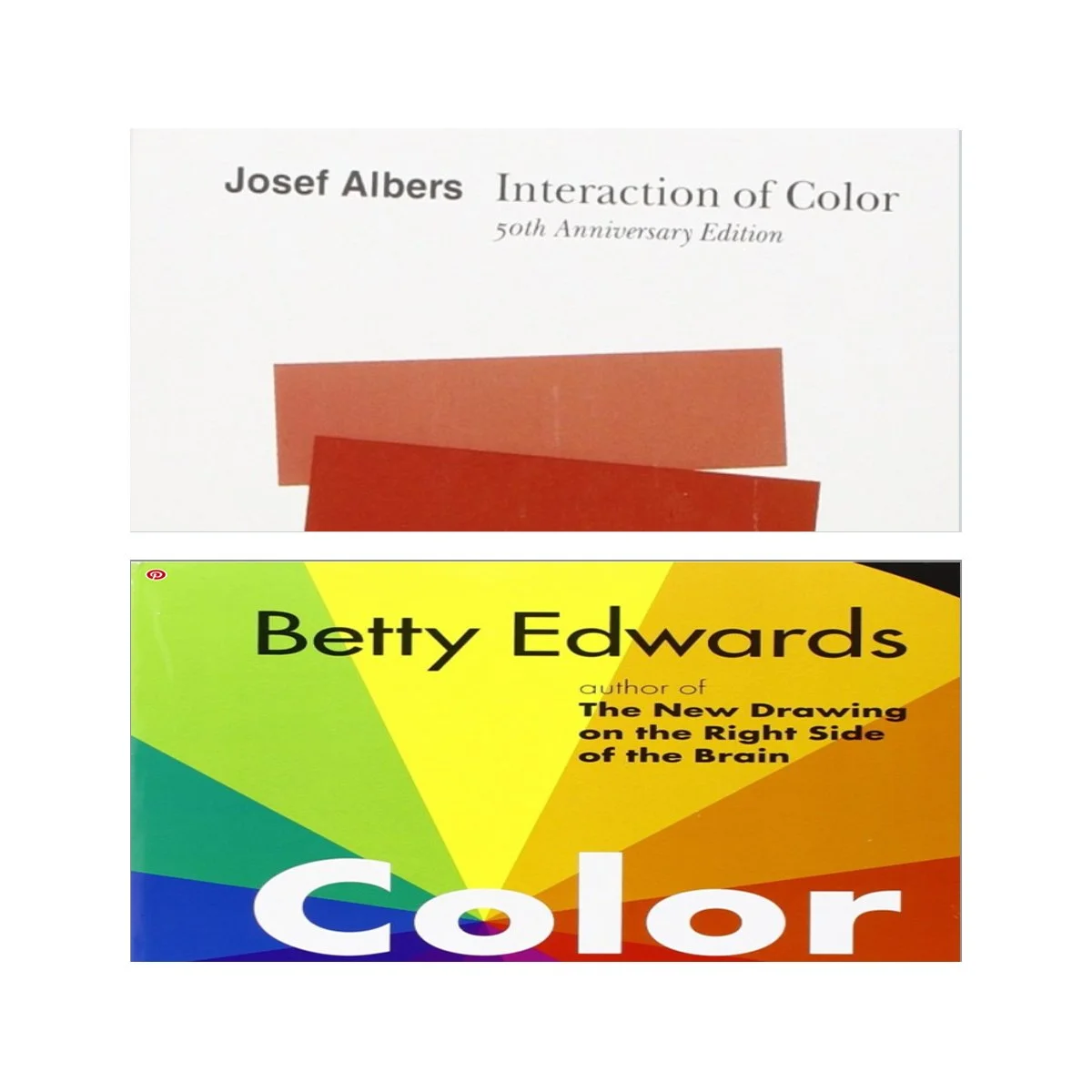
But, I digress. The point of all this is how interesting the world is color wise and how mama nature displays it. So much fun to look at the world around you when you have even just a little bit of information. For me, it’s a candy store. Hope this gets you looking around your world with just a little more awareness. If you want to learn more about color, look at a book by Betty Edwards simply named “Color” and Josef Albers “Color Interaction”. Once you have a basic understanding, the next learning curve comes in mixing. You have to be able to see into the color and recognize what makes up a color to be able to bring that knowledge into the studio.
Another rather strange thing about me, is that I think I may have a version of synesthesia. I find color to have a taste to it. Some are just yummy….no other way to describe it. And certain colors have a sound attached, like nails on a chalkboard or a beautiful musical chord. As one of my mentors said….there is nothing inherently wrong with any food, or person, and I’m going to say “ color” . It’s just that some you have an allergy to or some you just don’t like. Natural selection I would guess and potentially in the structure of your eyes and how you see. No harm no foul. It’s all good.


